TinyMCE Guide to Effective Page Layout Design
About
Read on Omnivore
Read Original
Comprehensive guide by TinyMCE on how to create page layout that effectively uses visitors attention and conveys the message of the text and graphics.
This page is powered by Omnivore ‐ you can read more about how I use Omnivore here: Omnivore - Saving Articles for Citations in Obsidian.
Highlights
Through further studies, NN/g observed four common patterns that users follow to scan a page:
Users scan in the shape of a letter F, reading earlier sentences more fully and then only scanning the beginning of lines as they move further down the page.
Users scan by reading the headings of a page first to determine which sections (if any) they want to read.
Users scan the page more sporadically, paying attention to text that particularly stands out, such as bolded fonts, text in a different color, or sidebars.
Users scan to find the areas of the article they are especially interested in, which they then read more fully. ⤴️
Importance of mapping article layout to suit common user scanning patterns:
- 'F' pattern: make early sentences catchy (and relevant)
- Headings: Must clearly structure and identify points of interest in an article.
- Stand-out Text: These can act as anchors of interest within the body text.
Users may unconsciously prefer a specific scanning style, use a different style in different contexts, or even mix styles as they work their way through a web page. According to NN/g reports:
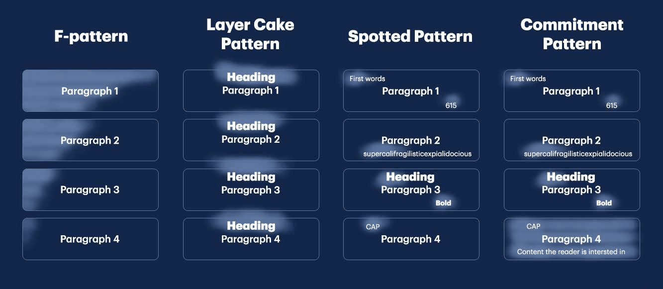
User scanning pattern names:
- F-Pattern: examine article in shape of an 'F'
- Layer Cake Patterns: Examine headings
- Spotted Pattern: search for distinctly styled text
- Commitment Pattern: Seek out areas they are most interested in and scan those more fully.
- whether they are looking for anything in particular
- exactly what it is that they are looking for
- whether the page is arranged well
By understanding that scanning is not a random act, but one motivated by the desire to quickly find specific information (or just to find something that catches your eye), you can design your pages in a way that delivers the most compelling information in ways that allow different types of scanners to find it quickly. ⤴️
Scanning is not a random pattern - articles can be optimised for skim-reading.
By developing a few base templates for certain article types, the bulk of the work is already done when it comes to designing your piece. You and your team can then spend your precious time thinking of ways to make the page even better – like tweaking and testing things like a new CTA placement, an animation instead of a picture.. ⤴️
Importance of article layout templates. These should enhance creativity, not restrict it.
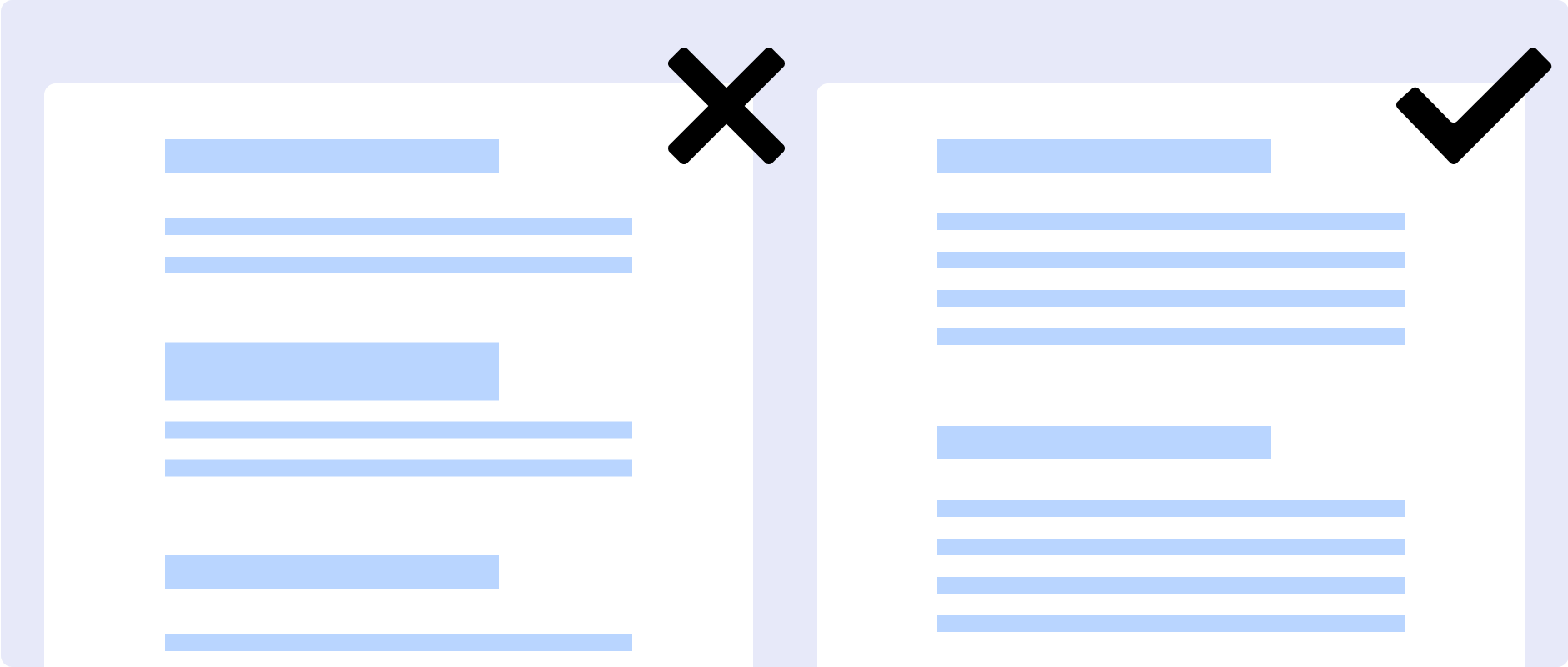
The optimal column width for effortless reading is 66-75 characters. ⤴️
Consider amending the pagewidth for the wiki to cater to this.
See MMW Github issue #43 Improve WYSIWYG between Obsidian & Quartz
On the other hand, if your lines are too narrow, it “breaks up words or phrases that are generally read as a unit, ” says Craig. On top of that, Baymard Institute explains, “too short lines also tend to stress readers, making them begin on the next line before finishing the current one (hence skipping potentially important words).” ⤴️
Goldilocks zone of line-length
Another suggestion is to put the perfect number of keywords at the start of your lines, so that readers can quickly understand what they’re going to get out of your content. ⤴️
Sentence openings are vital to retaining reader interest.
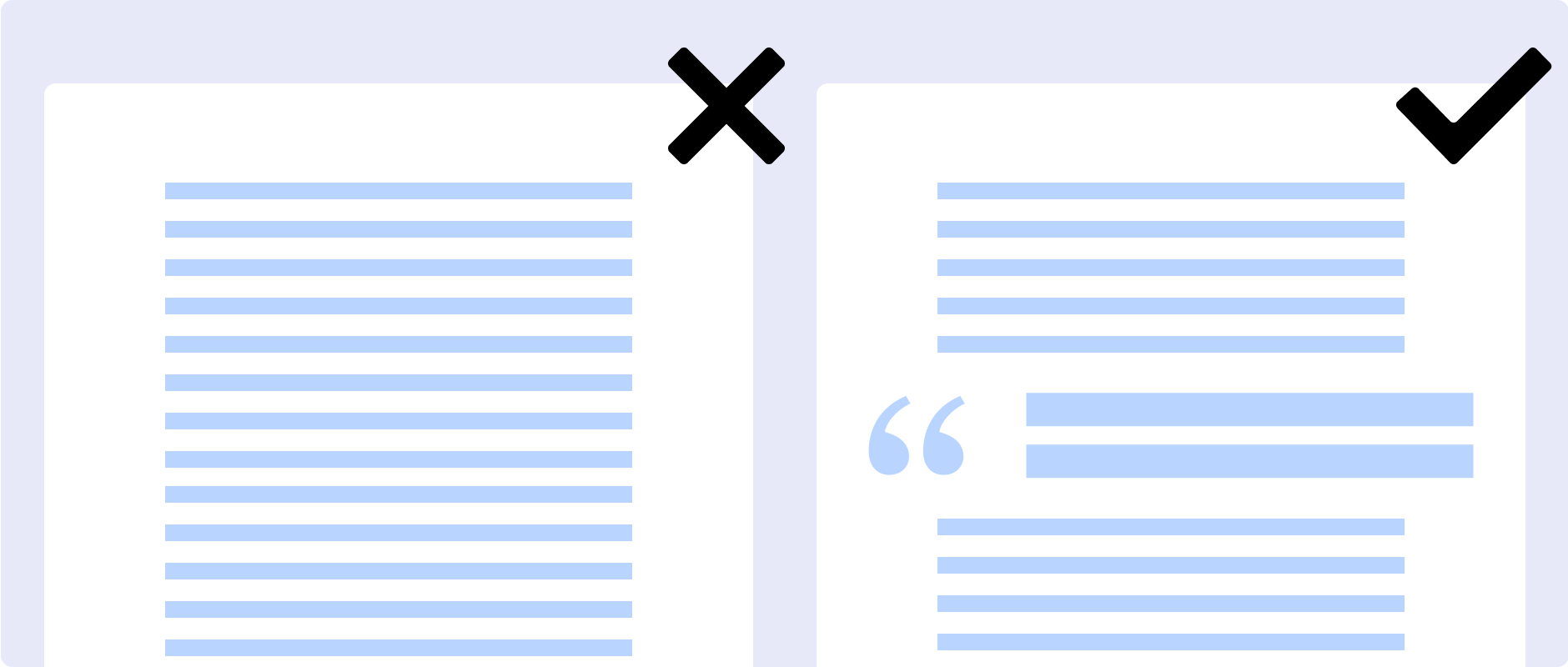
Use sub-headers throughout your articles, break paragraphs into smaller chunks, incorporate images throughout your post, weave in design elements to bring attention to key points, and use a strong call-to-action at the end of your post. ⤴️
Breaking your content into different sections – especially standard ones like an introduction, key points, and a conclusion – helps readers more quickly understand what your page is about and find the information they’re looking for.
Then, you can add a layer of creativity on top of that, using elements like lists, dividers, pull quotes, and sidebars that work together to improve readability and make the overall article more interesting.
Use a common convention of heading and section naming and styling. Familiarity allows users to more easily scan content. Creativity is layered on top of that to increase interest/retention.
Another way to improve navigation for users? Make every bit of your page searchable! A reader in search of something specific, will often turn to the good old Command-F or Control-F function to search for keywords on a page, so make sure all your text – including things like pull quotes and tables – is searchable rather than static images. ⤴️
Searchable text is another method of scanning – don't bury important text within images.
PRO TIP
Think about how you can combine smart organization of your text with images for an extra pop. For instance, take a bulleted list to the next level by replacing the bullets with small graphics or related illustrations.
Highlight especially relevant data by pulling it out of the paragraph and turning it into a visual element on the side. Get creative with how you combine eye-catching visuals with your content to better convey your message and drive attention. ⤴️
According to NN/g, things that can pop out within a block of text include:
- Bolded or underlined words
- Text in a different color from the main body
- Numbers written out as numerals
- Text in quotation marks
- Bulleted lists
Design elements like pull quotes, sidebars, or explanation boxes in different colors or styling can also be a way to add visual interest throughout the page. ⤴️
Tips for the 'Commitment Pattern'
incorporating a visual or design element every couple of paragraphs is key to retaining readers and keeping them scrolling onward through a story.
do everything you can to accentuate the most important information – while also preventing additional information from cluttering the page so that it’s hard to scan.
Making use of your margins and other smart formatting can help achieve this. For instance, you might have an important tip in a box in your margins to make it easy for someone skimming down the page to spot it, or an especially impactful quote pulled out of the paragraph and set in a larger font. On the flipside, you may decide to use sidebars or footnotes to pull additional information out of the flow of your main content so it doesn’t distract scanners – but allows readers to dig deeper if they want. ⤴️
CTAs in blog posts don’t have to be limited to buttons in the traditional sense. Other clickable elements can also be used throughout articles to help increase time spent on-page, like a carousel of related stories at the bottom of a post or visually consistent and standout hyperlinks throughout. ⤴️
“In lieu of headings, [people] use links to get a sense of what a section of text is about, ” says NN/g, so make sure at least some of the link copy highlights a relevant point to the paragraph as a whole. The company goes on to advise using “the information-bearing word, phrase, or heading as the link rather than adding an additional word or button, ” like the standard “Read More, ” “Click Here, ” and so on, as this “prevents gratuitous page clutter as well as needless fixations, and is better for accessibility.” ⤴️
before you publish anything on your site, always make sure to check what it looks like on mobile. Adobe shares that 73% of users say it’s important to their reading experience that the content displays well on the device they’re using, and according to WARC, almost three quarters of internet users are expected to access the web (and your content) solely by their smartphones by 2025. ⤴️
Use headings wisely, keep paragraphs short, and be sure to break up blocks of text in a visual way. Readers will ignore walls of text, so when structuring your content, put yourself in their shoes. Make it as easy as possible for your audience to consume and engage with your content by employing a predictable, clear, and attractive structure. ⤴️
A successful layout leads the eye across a page or post, making sure to entice readers and sustain their attention at pivotal points in the piece – or places where they might potentially lose interest. And remember: it’s not about mere decoration. Every visual element – from icons and stock photos to headers and accent copy – needs to work together to help the reader easily and quickly understand the story. ⤴️