Tiny Blog - Do emojis and accessibility work together
About
Read on Omnivore
Read Original
An article from Tiny Blog on how to make emojis in web content accessible.
This page is powered by Omnivore ‐ you can read more about how I use Omnivore here: Omnivore - Saving Articles for Citations in Obsidian.
Highlights
In the case of emojis, you may think they’re adding visual interest and emotion. But for visually impaired or blind users, they frequently have a negative impact on the clarity of your content, social updates and messages.
How emojis appear to a screen reader
A screen reader translates an image’s meaning via its alt text, and emojis are also ‘read’ through a type of alt text – the Unicode string – which represents each emoji. Screen readers interpret the Unicode character string used by browsers and operating systems, to understand and display emojis.
However, when those technologies read out the description or name of an emoji, it frequently doesn’t make sense to the listener or there’s a mismatch. ⤴️
What emojis look like with low vision
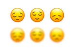
Some emojis look extremely similar. For example, the pensive, relieved and disappointed emojis have only small differences – that are often not visible when rendered on a smaller screen, let alone if you’re viewing them with a vision impairment. When blurred to simulate low vision, it's incredibly difficult to discern the difference between the pensive, relieved and disappointed emojis.
Equally, if multiple emojis are used in a string and are the same color, some eyes (including older people) may have difficulty distinguishing one emoji from another. ⤴️
Vision impairment is a spectrum - it is a misconception that blindness is a complete loss of all vision for those affected. Custom Icons used for the Morrowind Modding Wiki should be clear, visually distinct from each other, and universally understood symbols.
Best practices to ensure your emoji and accessibility work for your content are:
1. Don’t use an emojis as a replacement for text
It goes without saying, but no matter the cleverness or emotion that an emoji adds to your content, they should never replace words – they’re only ever an enhancement. ⤴️
Besides the personal taste factor as to whether inline-text emojis should be used within the actual content of Morrowind Modding Wiki articles, this is a strong accessibility argument against such practice and should be considered in the wiki's style guidelines.
2. Be careful where you place your emojis
For accessibility, emojis are best placed at the end of your message, social caption or sentence.
Whenever they’re placed within a string of text, the screen reader expresses them with the emoji’s alt text, so it disrupts the flow for visually impaired users and delivers a poor user experience. Keeping them at the end, makes it much easier for screen reader listeners to follow. ⤴️
Using emoji-prefixes for folders and notes directly goes against this principle.
5. Don’t rely on emojis to convey your message to a screen reader
Emojis should only ever be used to ‘add’ to the context of your text – never as a replacement.
Despite the popularity of screen readers (JAWS, Zoomtext, Windows Etes, Voiceover and NVDA) not all of them read out emojis – so don’t rely on the emoji to carry any part of the communication load, otherwise your true meaning may be lost to a portion of your audience. ⤴️
Final thoughts
The bottom line with emojis and accessibility, is ensuring that they work for, not against your content.
It’s about delivering equality of access in all circumstances, and creating a benefit for everyone through the creation of inclusive content. ⤴️
“The argument for accessibility, that doesn't get made nearly enough, is how extraordinarily better it makes some people’s lives. How many opportunities do we have to dramatically improve people’s lives just by doing our job a little better?”
Steve Krug, User Experience professional and Author “Don’t Make Me Think” ⤴️
Morrowind should be for everyone, as should Morrowind modding.
