Obsidian Grid Callouts - joschua.io
About
Read on Omnivore
Read Original
How to arrange content in Obsidian in columns without any plugins.
This page is powered by Omnivore ‐ you can read more about how I use Omnivore here: Omnivore - Saving Articles for Citations in Obsidian.
Highlights
Implementation
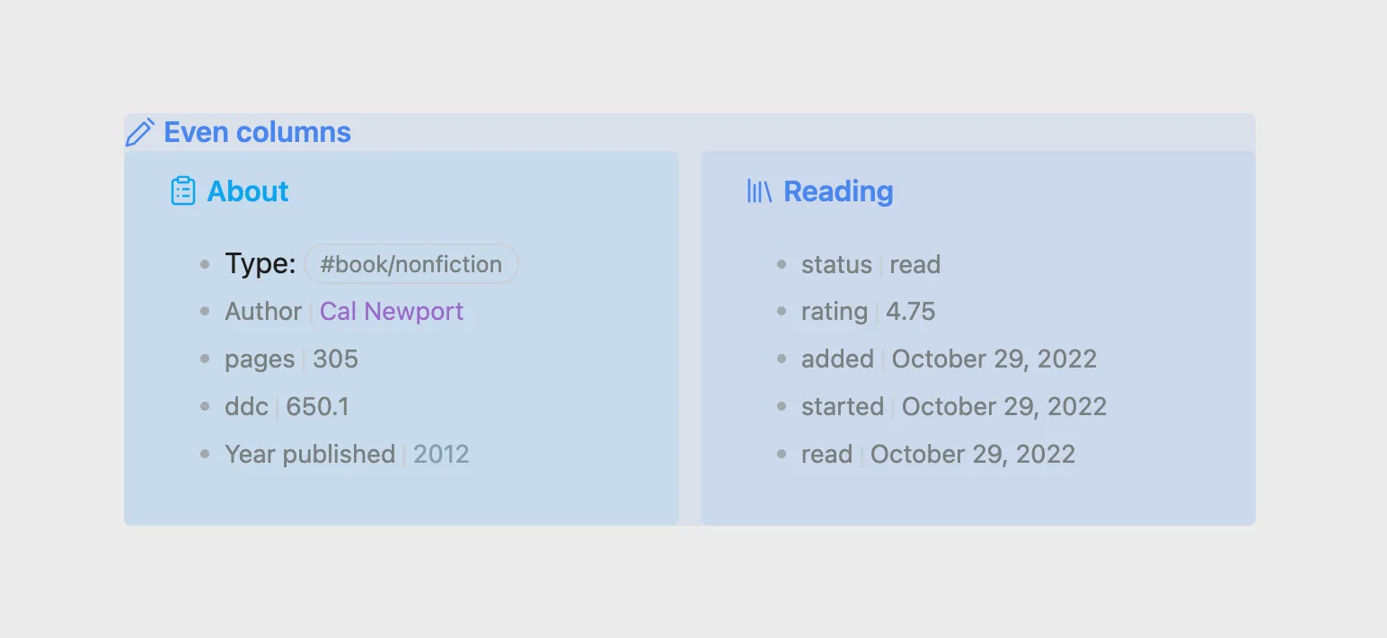
The two callouts that are displayed side by side are actually encapsulated by another callout. This callout arranges all its content in columns.
Article contains CSS snippets for grid callouts
A CSS snippet in Obsidian applies the styling.
.obsidian/snippets/callouts.css:/* Even columns */ .callout[data-callout="even-columns"] { /* Removes padding and background colour from the container */ padding: 0; background-color: transparent; } .callout[data-callout="even-columns"] > .callout-content { /* Arranges the content in columns */ display: grid; /* minmax sets the minimum width of a column. Make the columns 'skinnier' by setting 15rem to a smaller number */ grid-template-columns: repeat(auto-fit, minmax(15rem, 1fr)); gap: 12px; } .callout[data-callout="even-columns"] > .callout-title { /* Hides the callout title */ display: none; } ``` [⤴️](https://omnivore.app/me/obsidian-grid-callouts-joschua-io-18e9c3f29f0#bb441ba0-0bed-488a-86d0-cc488fa4e9b6)
Note that grid-template-columns: uses the 'repeat()' function, which "represents a repeated fragment of the track list, allowing a large number of columns that exhibit a recurring pattern to be written in a more compact form.
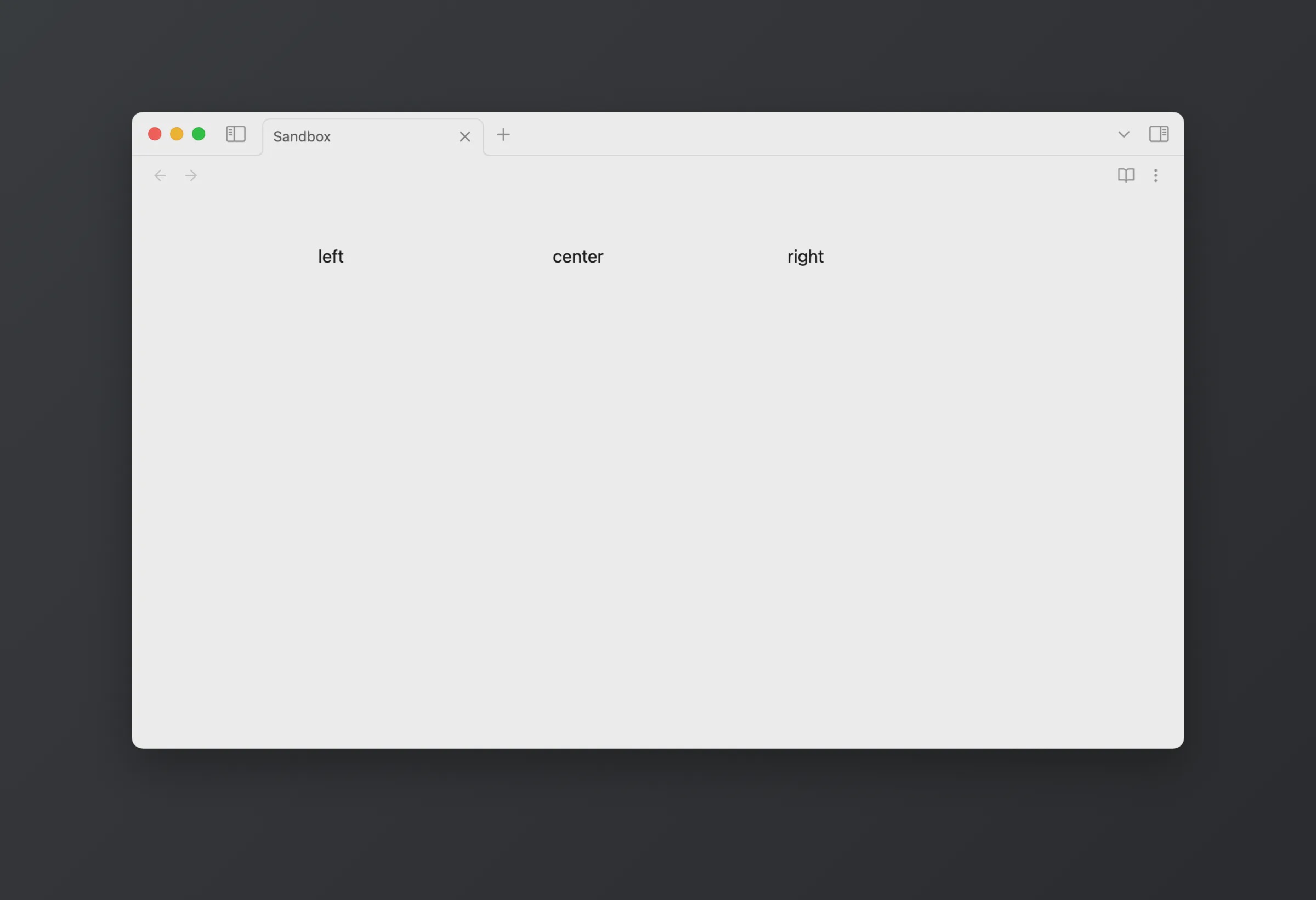
The great thing about grid is that it is really flexible. Each new line in our callout automatically moves into a new column.
>
>
> center
>
> right

On a smaller display size, for example on mobile, the columns stack responsively depending on how much space is available. ⤴️
This callout actually creates columns by default in the parent container call
